Previous release: Inkdrop Desktop v5.9.0-beta.0
Hey, what’s up? It’s Takuya.
I’ve finally finished refactoring the theming system and I’m super excited to announce it ![]()
 Theming is now simpler than ever
I’ve been working on refactoring the app’s theming system to make it easier to customize and maintain for future versions.
The UI components were originally from Semantic UI, and Inkdrop has relied on its well-designed theming system based on LESS, an alternative stylesheet language with some extended syntaxes like variables.
However, modern CSS now supports a lot of features that LESS has provided, such as CSS variables and CSS nesting. Moreover, CSS supports cascade layers, which allow you to control the specificity and order of rule sets across stylesheets. They would be very useful for theming in Inkdrop.
The main issue was that Semantic UI themes include everything from resets and layouts to buttons, dropdowns, and menus. This is because Semantic UI’s theming architecture wasn’t designed to be dynamically loaded or switched.
This limitation has prevented me from adding new UI components and updating current designs.
Also, it was hard to understand the LESS-based theming architecture for contributors, including Gulp tasks for building it.
The new theming system is much simpler. All you have to do is customize CSS variables. No pre-compilations needed.
For example, here is a part of the new Solarized Dark UI theme:
:root {
  --primary-color: hsl(var(--hsl-blue-500) / 90%);
  --input-background: var(--color-bg);
  --page-background: var(--color-bg);
  --text-color: hsl(var(--hsl-fg));
  --link-hover-color: var(--color-blue-300);
  --sidebar-background: var(--color-bg);
  --note-list-bar-background: hsl(var(--hsl-bg-muted-highlight));
  --note-list-bar-border-right: 1px solid hsl(var(--hsl-base02));
}
Instead of using LESS variables to let you customize component styles, the app now refers to these CSS variables to apply customizations on top of the default styles with CSS cascading layers.
This way, I can safely change the existing styles and add new components without making breaking changes to the existing themes.
If I were to add new components, I could define new CSS variables with fallback values, something like:
.new-component {
  background: var(--new-component-background, var(--strong-transparent-black));
}
If --new-component-background isn’t defined in your theme, it automatically falls back to --strong-transparent-block. Neat.
Please check out the updated guide on how to create a theme here!
 dev-server
But how do you explore available CSS variables? It’s easy.
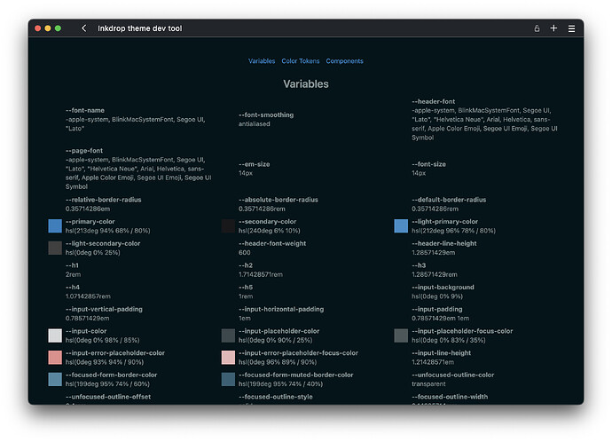
I’ve made a tool that lists all the variables you can edit, and it also previews the current values.
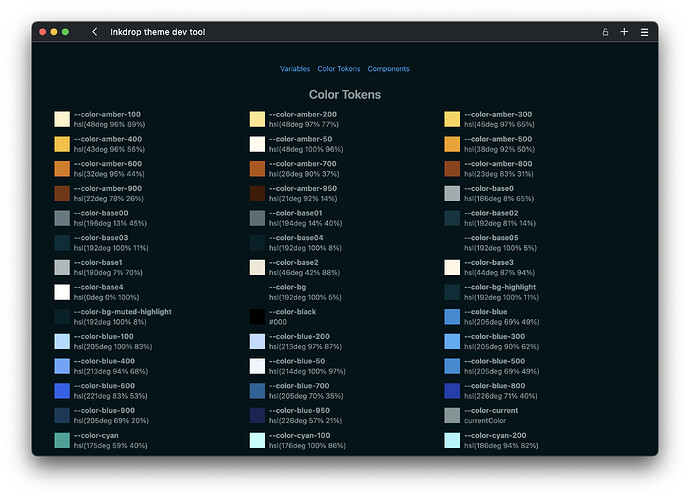
The app has pre-defined color tokens:
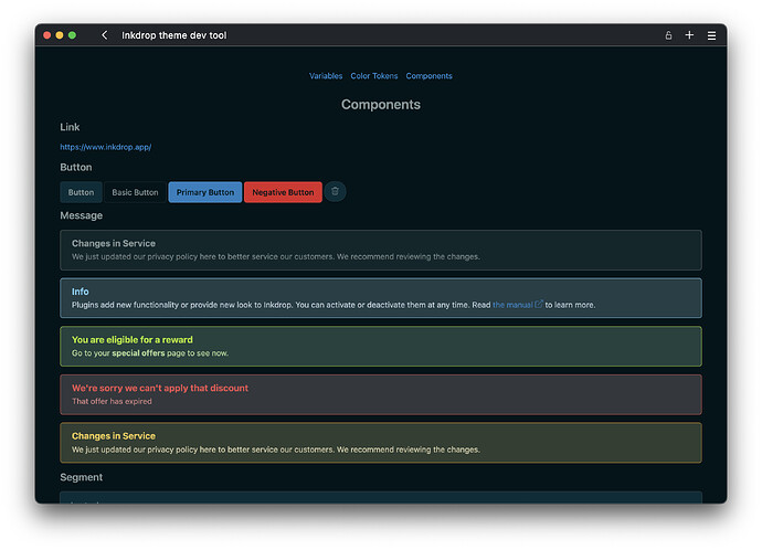
And it previews some UI components with hot-reloading:
I hope you enjoy creating your themes with these tools!
They are mentioned in the guide here.
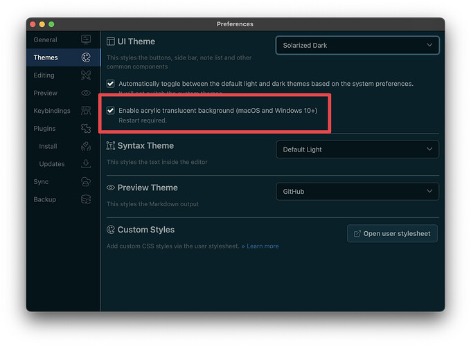
 The acrylic translucent background support is back on Windows!
Since Electron started supporting the backgroundMaterial option for Windows, the acrylic effect has returned now!
However, there is a critical bug preventing it from working properly on frameless windows.
To resolve this, I had to add a system window title bar, but it actually doesn’t look so bad.
The default light and dark themes support the acrylic translucent background out of the box, so Vibrant Dark UI will be deprecated soon.
Check out the documentation on how to make your theme support the acrylic background mode.
 Mobile support (in the future)
Users have been requesting more themes on the mobile app (1, 2, 3).
I’ve been exploring a way to port custom themes to the mobile version.
Previously, this was impossible since the mobile app is built with React Native, where CSS can’t be simply applied to the UI components.
But as the new theming system relies on the CSS variables, you can now generate a JSON file from the theme.
You can simply run the generate-palette command in the theme repository.
Check out the documentation for more details.
It still needs more work though, I can’t wait to bring your themes into the mobile app!
 Minor design improvements
I’ve rewritten the default UI themes for migrating to the new theming system.
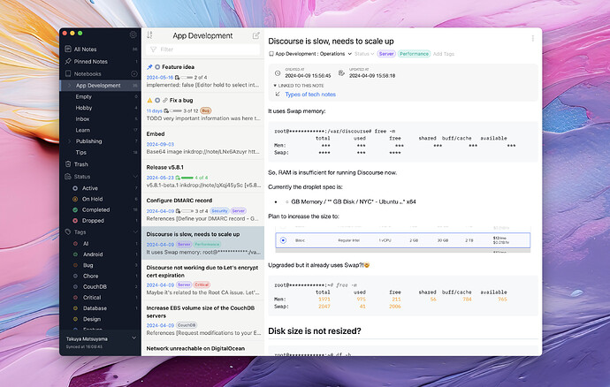
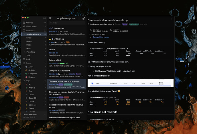
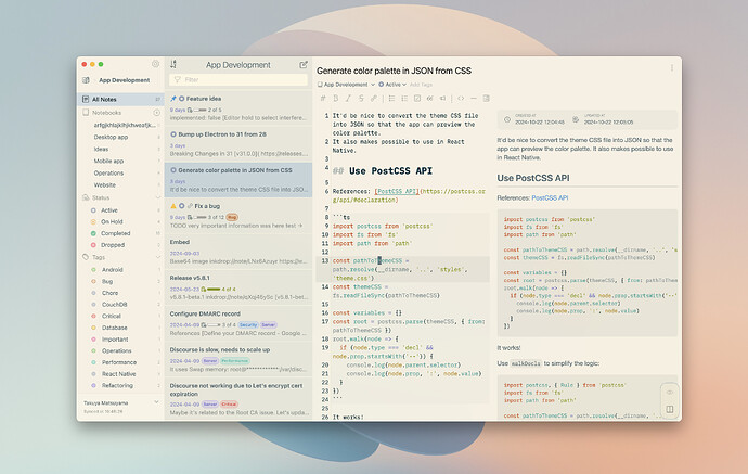
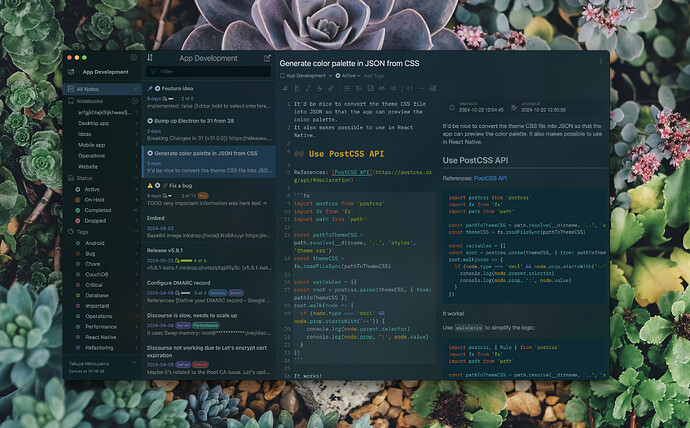
Here are what they look like now:
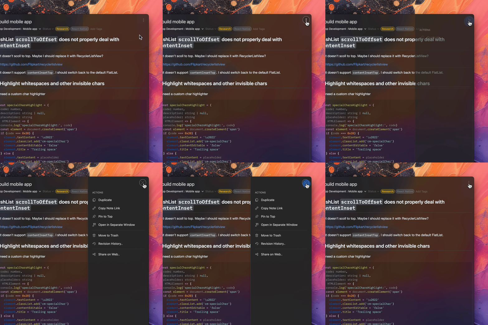
 Editor drawer animations
 New themes: Solarized Light and Dark UI
They also support the acrylic background! I love them.
I hope you like them!
Other improvements
- Bump up Electron to 31.6.0
- Bump up PouchDB to 9.0.0
- Hopefully, it will solve this error
- Display the loading indicator when loading more plugins (Thanks Palmar)
Migrating your themes to the new system
While the app still has a backward-compatibility for the old UI themes, I would strongly encourage the theme creators to update their UI themes, or they will eventually be broken since I’m planning to add new features with new UI components.
So, please check out the updated guide in the docs.
If you have any questions, feel free to post questions on the “Developers & API” category on the user forum here.
Change the Inkdrop target version to “^5.9.0”
Do not forget to update the “engines.inkdrop” field in your package.json to ^5.9.0 so that the update won’t be installed on the older version and surprize the users. It should be something like this:
{
  ...
  "engines": {
    "inkdrop": "^5.9.0"
  }
}
Join the beta testing
Note: Login required
Thank you for your feedback, as always![]()
