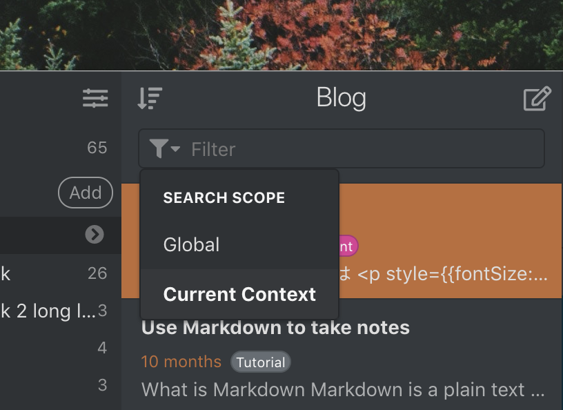
Please remove the search context from the search bar. Also please allow searching for tags using the globally ubiquitous syntax: #tagname
Removing Search Context
99% of the time I just want to click inside the search bar and filter notes on text or tagname. The context is already implied via highlighting of the notebook/status/tag on the left sidebar. There is no reason to show the implicit filters in the search bar. It feels like it’s only purpose is to make the user aware of the various filters so they don’t have to be taught elsewhere, or simply be implemented as UI controls.
I can no longer click on the search bar and start typing. I have to position my cursor correctly and add an additional space. This may seem picky but its such a common and repeated use case that it really lowers usability. It also ruins typeahead or realtime searches unless I position the cursor at the end of the search string (which may not even be visible) because if I position the cursor at the beginning of the search, the string won’t be valid until I type my search and then hit space. I like the ability to do advanced searches with these filters but I’d much rather have no advanced search at all if its going to degrade the experience of how I search 99% of the time.
Use Regular Tag Filter Syntax
Pretty much every application that allows searching by tags uses #tagname. At this point its just commonplace UI/UX design. You don’t even have to train users on it, they’ll just intuitively use it. It’s far nicer than the Inkdrop idiosyncratic syntax: tag:tagname. Which is also longer to type out.
Ideally I’d really just like to be able to select my notebook or status, and then filter on text and tag names. You could add some sort of section on the other filters you can use like -status:completed or status:onHold. Or perhaps have a toggle button that switches from basic to advanced/full search, where implicit filters will be visible. I think the UI for Inkdrop is incredibly refined except for this one area.
Thank you for the suggestion.
Yeah, I understand that the searchbar is kind of ugly now.
It could be improved in terms of UI as you suggested, like toggling default conditions and having a button to switch basic<->advanced search mode.
However, the sidebar can be hidden so the the context filter needs to be displayed on the searchbar.
Current searchbar is inspired by GitHub’s one on the issues page because I’m used to search on GitHub.
I don’t feel like adding complex UI for search. I like the simplicity of GitHub’s.
So I guess it’s a personal preference.
But I understand it’s painful for you.
I’d like to rethink about the search UI, something like showing the context filter as a placeholder on the searchbar so it won’t bother your input.
It would affect much in UX, I’d like to consider it carefully.
I agree to support #tag syntax. It’d be great to have.
I came to the forum to suggest exactly this. Search is one of the most important features of a note app (it is the primary reason I use Inkdrop in favour of just a bunch of .md files in a dropbox folder). It should work smoothly
Improvements could be:
Already add a bunch of spaces in the beginning. This allows you to click and just start typing.
Shorten the context. For example, use ✓ instead of completed
Have two search bars, one for typing beneath eachother, and one for selecting context (but internally you could just join them together and let it function as one)
I hadn’t considered the github search, which makes a bit more sense now. I think I would have probably used evernote as the standard reference as that’s probably the closest UI that lots of users are already trained on.
Two things regarding github’s UI:
The existing filters always leave plenty empty space on the right in the searchbar for you to click
They add an extra space after the existing filters so you can just click and go
I understand this isn’t something you’d want to redesign more than once, so take your time and get it right, but in the meantime I think the above two points could be added pretty painlessly. Especially #2.
Seems like you two always click on the searchbar when starting to search notes.
BTW, do you know there’s a shortcut key that gives a focus to a searchbar with Cmd-Shift-F / Ctrl-Shift-F?
The cursor will be at the end of text. So you can quickly start typing keywords.
Adding an extra space would work though, also I guess it would improve usability: all text will be selected when the searchbar got a focus.
I definitely think this is a step in the right direction. It allows for easy simple text searches, although tags aren’t indexed, and tag:tagname is still kind of verbose. Also, I’d really appreciate that extra space in case I want to keep the context for the search (Cmd-Shift-F, right arrow, start searching vs Cmd+Shift-F, right arrow, space, start searching).
Another way to go would be just have Cmd-Shift-F (and/or search focus) set the cursor to the end of the search input, instead of highlighting everything (with space auto-inserted when clicking different contexts on the sidebar).
I saw your v3 roadmap article on medium, and I think something like a multiline textarea (maybe auto-sizing?) vs a normal text input sounds like a great idea. Word wrapping with hyphens can be tricky though.
Thank you for letting me know your thoughts. tag:name can be displayed like 🏷name in the search bar.
Some people prefer selecting everything when typing Cmd-Shift-F, so it would be a personal preference.
Adding a space automatically at the end of query would be nice so you only have to type right arrow.
Let me try those ideas.
BTW, I’m currently working on end-to-end encryption feature.
I’ll announce when it’s ready to roll out in beta program!
I would like to close this issue since the search UI has been improved as of 4.0.0-beta.1.
If you have any other suggestion/problem, please create another topic.
Thanks for the discussion!