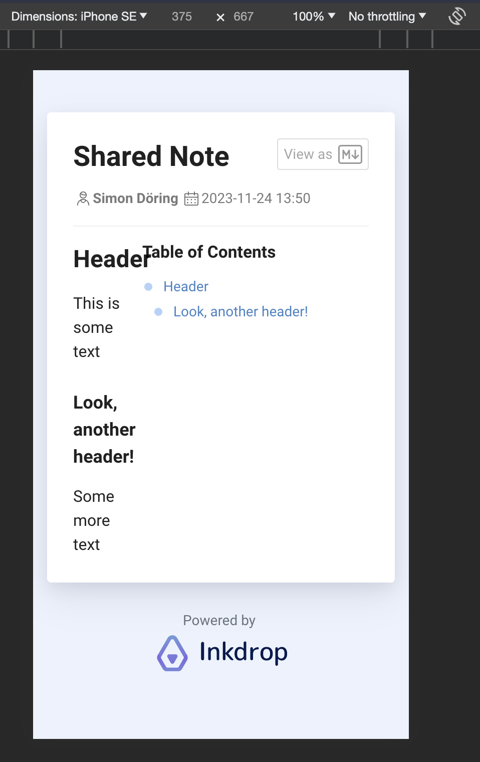
Hey again, I just noticed that the page that displays shared notes on the web is not responsively designed, so it looks wanky on mobile. I don’t see it as a big problem, but putting the table of contents above the note content on narrower screens would probably be an easy and quick solution nevertheless 
Hi Simon,
Thanks for the report. Fixed it!
It was due to specifying breakpoints with CSS variables, while media queries don’t support using them… I haven’t realized that. So, fell back to Sass-like variables for now.
1 Like