Hi there
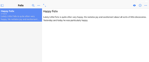
I’m back on trying Inkdrop and have a question about the layout of the rendered view. On iOS an entry looks very clean in rendered view:
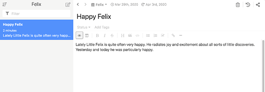
In contrast on macOS in rendered view the toolbar is still visible:
Looks pretty busy for a reading view… So why is this?
craftzdog
(Takuya Matsuyama)
2
Hi halloleo,
Thank you for the question.
You can hide toolbar from Preferences if you don’t like.
craftzdog
(Takuya Matsuyama)
3
Well…That’s because I initially designed it based on Evernote.
There seems to be room for improvement though.
Thanks Takuya.
Without the toolbar the Render view looks much better.
But of course in Edit mode the toolbar wouldn’t hurt… Not a big deal for me though.
craftzdog
(Takuya Matsuyama)
5
v5.0.0 has much cleaner UI now 
Thanks again for the feedback.
1 Like


