Hey everyone,
First of all, a wonderful app and it has been of significant help to me the past year.
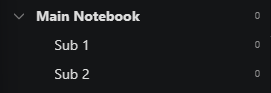
Now that I have saved quite a few notebooks, I was wondering if I can ease navigation by making the parent notebooks distinctive. For example with a heavier font weight or different color. In this case Main Notebook
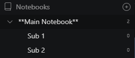
Looking at the elements, I found it difficult to target as each unit are not childs but with a different padding-left (14px vs 32, 50 or 68). Furthermore, I only wanted to target my “actual” notebooks, and not other navigation items such as the ‘All Notes’ or ‘Trash’ section. Ultimately I ended up with below. It works, but I have the strong feeling that I made it much more complex than required. I’m a avid learner, and hopefully someone can guide me into a handier direction. Thanks in advance!
.sidebar-menu-item.selectable[style="padding-left: 14px;"]:not(.sidebar-menu-section-notebooks):not(.sidebar-menu-item-all-notes):not(.sidebar-menu-trash-list-item) {
    font-weight: 700;
  }