Hello - I am running into an issue where inkdrop is not utilizing the full width in the editor window. This happens regardless of whether this is opened in the main Editor window or if opened in a standalone window.
I have noticed this problem in the 4.7.0 beta 4. Release 4.6.1 doesn’t have this issue.
Info
Platform: MacOS
Platform version: Catalina 10.15.5
App Version: 4.7.0 Beta 4
Reproduce
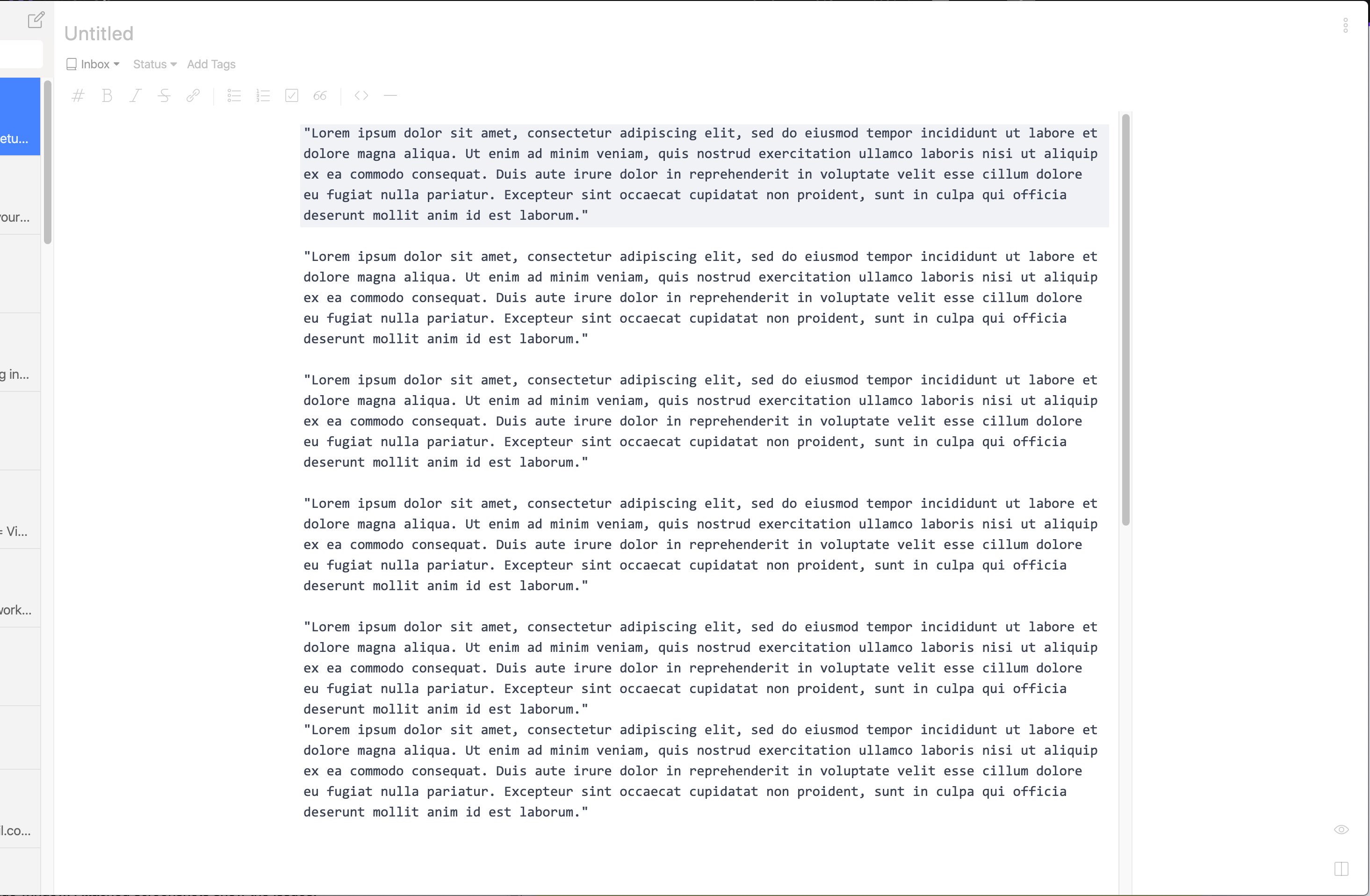
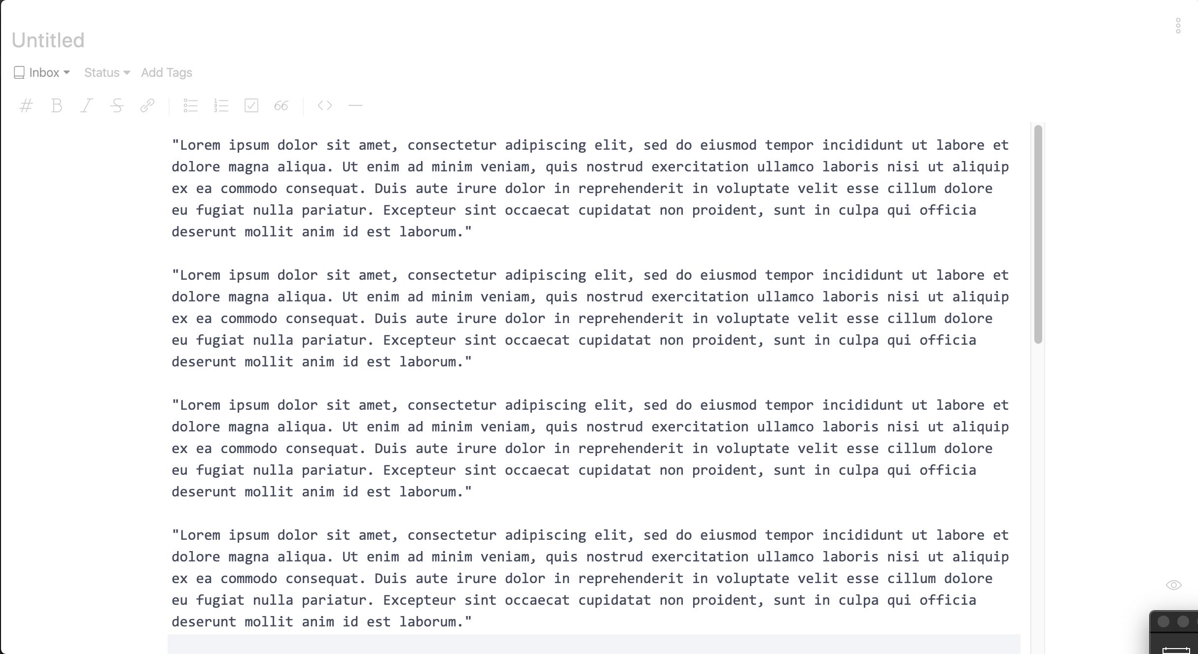
Write a long text in a wide window. Attached screenshots show the issues.
Thank you for reporting it.
Actually, I made a change for that in beta.4 because many other note apps seem to have the same behavior like Bear.
Maybe it relies on a personal preference as I see some people prefer to use it with the maximized window.
With the full width editor on the maximized window, it is too wide to write things.
Looks like you don’t like it. Could you tell me why?
I’m not Vikas, but I personally never used a note taking application that centers note content like this, and as such have a personal preference towards the note content hugging the sidebar when it’s open. I do, however, see the improvement in centering note content when in distraction free mode.
I have been able to get around this issue by adding the following to my styles.less file (1180px is the width of 100% on my monitor when the sidebar is open):
For my personal use I liked the max-width implementation.
I prefer let the editor aligned in left (near the menu) instead of centered.
And show the editor boundary.
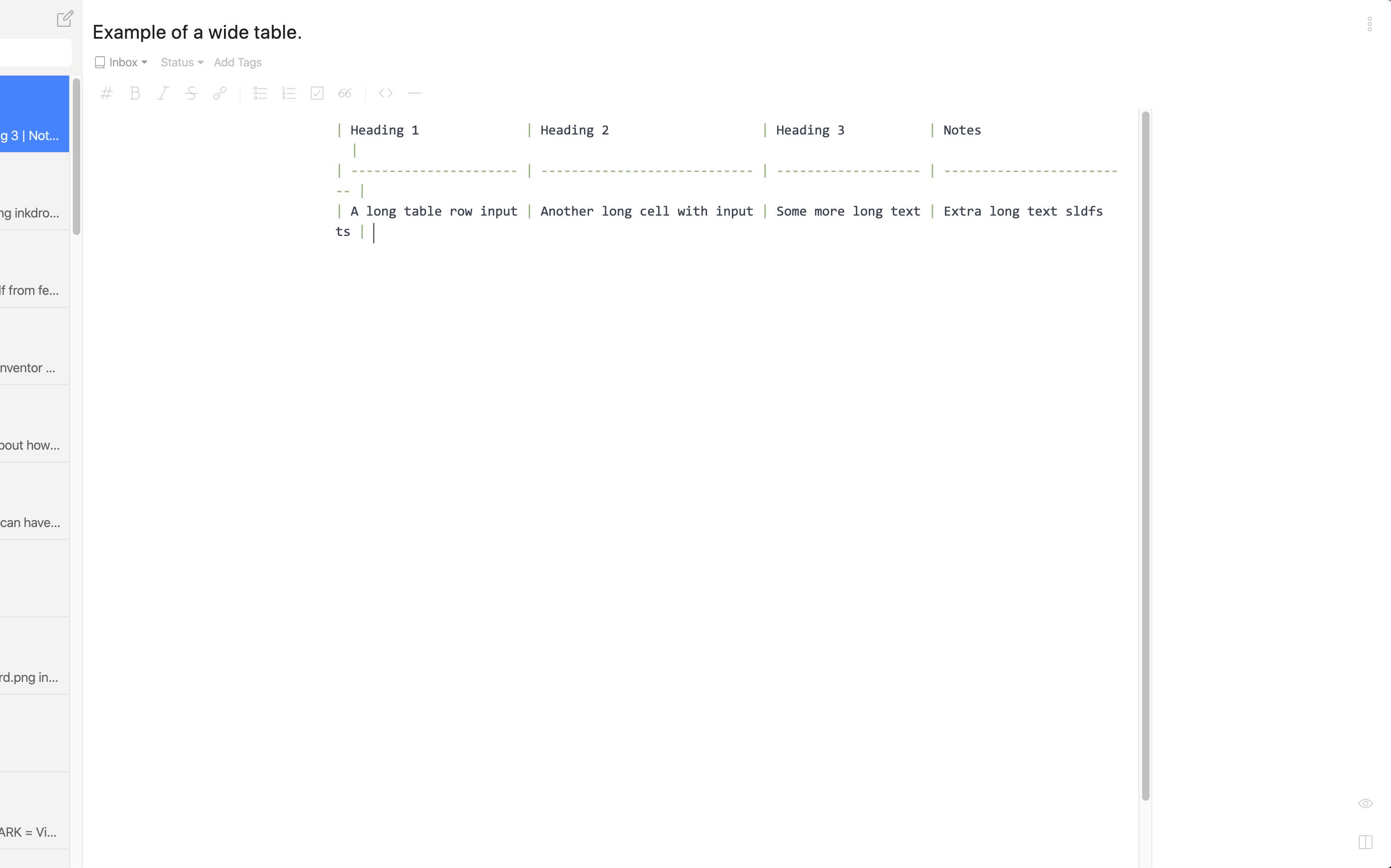
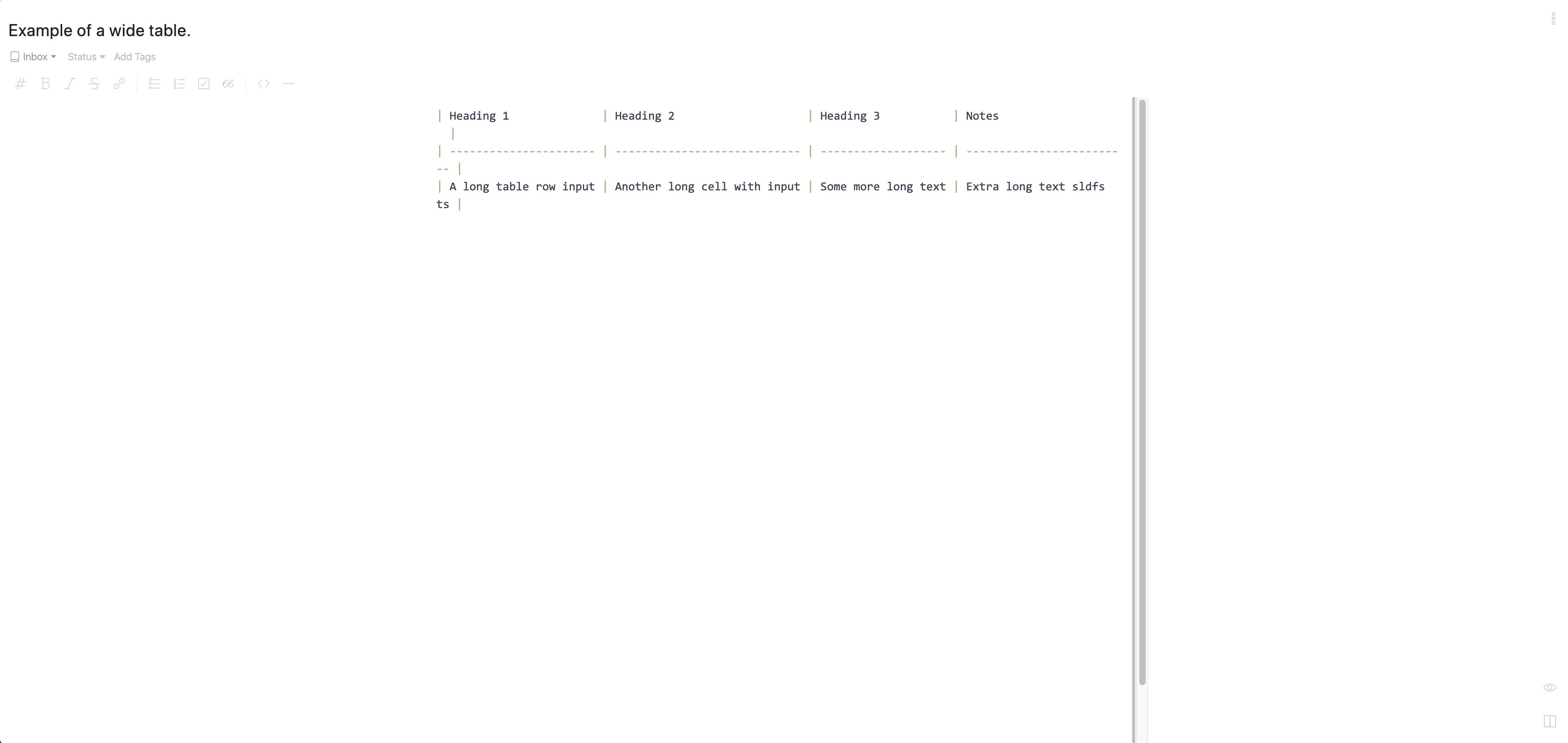
Having it centered makes it very hard to have wide text fit in properly. For example, one of the notes that I have has a very wide table and as you can guess, it doesn’t reflow very well. In essence this is ok for the regular markdown text, but when it comes to preformatted stuff, like a table, it doesn’t work very well. In addition, the scrollbar in the middle of the text area looks really weird.
I have tried attaching a screenshot that shows an example like that.
I haven’t tried the workarounds that are suggested here, but I use two monitors and don’t want to have to restrict inkdrop to only one screen. If you do want to make this a permanent feature, my request will be to have a config option to disable this.
I too (like Jasper van Merle) prefer the note content using the space between the sidebar and the window boundary.
Thank you for the feedback, guys!
Looks like there are various personal preferences on this.
Makes sense that writing tables needs wide space.
Let me rethink about it.
Quickly chiming in here – (as a UX designer) I think it’s just a visual styling issue. It’s not just bear that does this. iAWriter, Ulysses, many other great writing apps do this and do it elegantly.
One apparent visual issue is the placement of the scrolling bar. If you put the padding on the text itself, and leave the scrolling bar still at the very right edge, it will look way more “correct.” (And people may not even notice it)
Now that you have the outer container to be at 100% width still, you can give table element a permission to go out of the content width and have it still be center-aligned.
Then, I think the editing panel typography just need some more CSS control. I like the simplicity of letting people directly control font size, family, etc. in the settings, but really font size should be a function of the window width. Maybe make editor theme-able and/or encourage people to use em values (or even just provide a slider) for font sizes?
That’s very insightful! I like the idea that the scroll bar should be placed at the very right edge.
Permitting table elements to use the full width would be nice, but it’s going to be a complicated feature.
TBH, I don’t have enough motivation to implement it just for the center-aligned layout.
I’ll consider reverting this change in the next beta release.
Since this is just a simple CSS tweak, it’d be good enough to document it (or to make a plugin) for those who want it.
 but I was on Windows when I felt the urge, and writing CSS on Windows was a even greater pain.
